
30 Aug Five easy steps to more universal design
Learning should lead to performance…
We, educators, hope that people will learn something from us, remember what they learned, and ultimately use what they learned to improve or extend their performance—at work, in their personal lives, or both.
Lately, I’ve had the good fortune to apply the Learn→Remember→Use concept to myself. I have recently met, heard, trained and collaborated with various people who know a lot about universal design.
In this post, I present the five most useful tips I learned, remembered, and now use, to make my learning materials more universally accessible.
First things first… what is ‘universal design’?
The concept of universal design applies to anything we design. This includes furniture, machines, workspaces, learning materials, and more.
To me, universal design means designing anything so anyone can access and use it. This is a simplistic definition. To learn more, have a look at the Centre for Excellence in Universal Design (CEUD). CEUD offers:
My top five quick and easy tips to apply principles of universal design to learning materials
Tip 1. Download the DAT
Vision Australia has produced a Document Accessibility Toolbar (a DAT) that we can download and add to our Microsoft Word toolbars. The DAT consolidates all the tools in MS Word that promote accessibility. This means I can access everything Word offers to help me make more accessible documents, from one place.
Here’s what the DAT looks like, once installed:
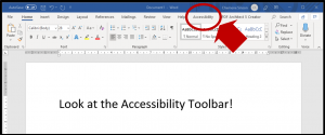

I’ve started using the DAT to easily access functions such as Alt Text (see Tip 2 below).
Tip 2. Add Alt Text to images
What is Alt Text?
Alt Text is short for Alternative Text. It is text that we embed behind an image, to explain what the image is. For example:

Alt Text for this image reads, Cricket Ball
Why use Alt Text?
Alt Text helps people with a sight impairment make sense of images used in our learning materials. Images may include photographs, infographics, company logos, decorative banners, charts or icons, to name a few.
People with a sight impairment often rely on a screen reader to make sense of learning materials. When a screen reader gets to an image, it will read the Alt Text embedded behind the image. Therefore, well-written Alt Text will help people understand the information or concept that the image conveys.
We can also use Alt Text to identify images that are decorative and do not add meaning to the text. For example, the discussion icon below doesn’t add meaning, so should be marked as decorative:

Screen readers will pass over images marked as decorative, rather than trying to interpret them.
How to add Alt Text to an image
In MS Word:
- access the Alt Text function from the Document Accessibility Toolbar covered in Tip 1 above, or
- look at Microsoft’s advice on how to add Alt Text to Word documents.
When writing online publications such as this blog post, simply select the image then use the edit tool to add Alt Text.
To save time, add Alt Text to the master versions of images that you use often—for example, your logo or a discussion icon. Then, copy and paste the master image throughout your document. This way, you only enter Alt Text for a popular image, once.
Tip 3. Capitalise the first letter of words in hashtags
In May this year, I attended the Association for Talent Development’s International Conference and Expo for 2019 (#ATD2019) in Washington DC.
I attended a session by Maureen Orey called, No learner left behind: designing inclusive learning programs and materials.
I picked up many ideas from her session, but my number one takeaway stood out because it was SO simple—capitalise the first letter of each word in a hashtag.
So instead of writing #greatideasforhashtags, we should write #GreatIdeasForHashtags
Why this works
If we capitalise the first letter of each word in a hashtag, screen readers will identify each word in the hashtag. But if all letters are lowercase, the screen reader will try to read all the words in the hashtag as one word… and that won’t end well!
Tip 4. Use a contrast checker
High contrast between text and background colour in a document makes any learning resource easier to read. For example, against this white background:
- this text colour has a higher colour contrast, and is easier to read, than
- this text colour.
Use a contrast checker to make sure text is universally readable
I’ve recently learned about this contrast checker. It checks the font colour, size, and background colour of any text within a document and will tell you how easily (or not) people with a sight impairment or colour-blindness can read it. I have found this very useful and have already started changing the colours and font sizes to make sure anyone can read materials that I write.
Tip 5. Add captions to videos
We know that captioning helps people understand video content, but I am a one-person operation with limited time and budget, so had always placed captioning in the ‘too hard’ basket.
Things have changed.
In June, I attended the Australian Institute for Training and Development (AITD)’s 2019 Workplace Learning Conference (#AWLC2019). One session that resonated with me was delivered by the Learning Uncut team of Michelle Ockers, Karen Moloney and Amanda Ashby. The Learning Uncut website offers recordings of conversations with leaders in the learning, development and performance field. Michelle, Karen and Amanda have ‘day jobs’ and created Learning Uncut just because they wanted to. So at #AWLC2019, they shared how they produce their recordings—with transcripts—on a budget.
The Learning Uncut team made me think, if they can do it, perhaps I can, too. So, I investigated how to add captions to videos. My research took me to a video recording program which let me add captions so easily that even I could do it!
Here’s my first attempt at a video with captions
To create captions in this video, I let the software interpret and transcribe what I said. I was amazed by how accurate the transcript was. The only error was the spelling of my name—Chemène. However, since most people struggle with my name, I forgave the software for getting it wrong. Once I corrected my name, the captions were good-to-go. I was surprised by how quick and easy the process was.
The free version of the program I used does not allow people to add captions to videos, but the paid version does. With a cost of just $1 per month, I decided that investment in the paid version was worthwhile!
How I’ve used these ideas to create more universal learning materials
- I have downloaded the Document Accessibility Toolbar and added it to my version of MS Word
- I now add Alt Text to all images in learning materials I develop, and am working through existing materials and adding Alt Text to these
- I’m updating my templates to ensure a universally readable contrast between fonts and their backgrounds
- I now capitalise the first letter of each word in hashtags (#SoEasyToDo)
- I am producing more videos with captions!
These five tips have helped me begin working towards more universal learning materials. I hope you’ll find them useful, too. Of course, there remains much to learn—#LifeLongLearning!